Font Choices And Justifications
Fonts used in other films
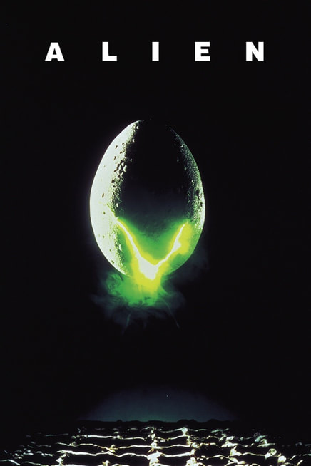
Alien
The font used in Alien is very simple, which adds to the films aesthetic of having a hidden villain until near the end, and the very flat unexpected tension.
|
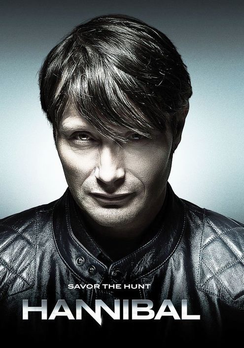
Hannibal
The title used in Hannibal has been deliberately designed to look like knives, adding to the imagery of cooking and murder.
|
Our trailer has a deliberate lack of cohesion and varies in styles of violence, pacing, and visuals/mise en scene. Therefore, it made sense to us to use a similar simple font to Alien, as its simplicity contrasts the lack thereof in the visuals. The titles themselves are semi animated, distorting in order to have slight ties to the distortion and filtering on some scenes. The main title in the trailer is handwritten, to give some level of homemade or indie feel to the trailer, so again multiple font styles makes sense with this.
