Question 1 - In what ways does your media product use, develop or challenge forms and conventions of real media products?
trailer inspirations
|
|
|
|
|
|
|
|
|
|
|
|
Movie scenes/Trailers/Music videos that are similar to our trailer content
using conventions
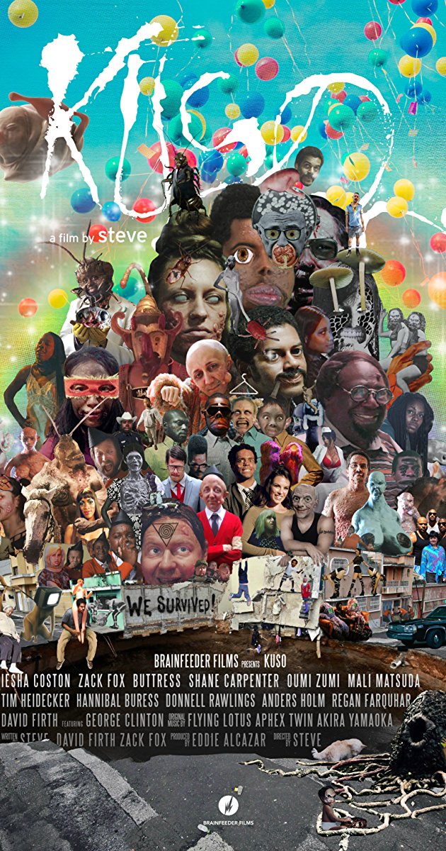
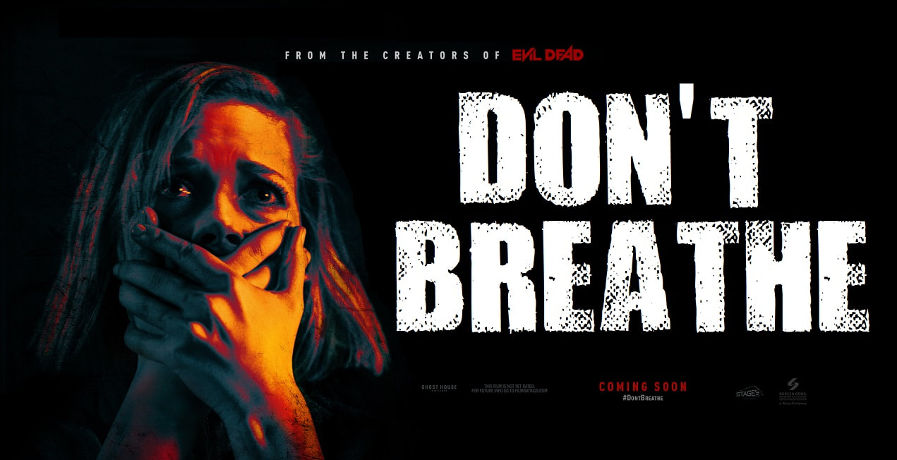
- Our trailer made use of a montage structure and fast pacing common in Horror trailers. The structure/pace of the trailer is heavily based on the trailer to the movie KUSO, which was our most prominent inspiration for the visual style.
- Our killer/anti hero fits the psychopathic killer stereotype, with his behaviour being a mix of hallucinatory or insanity reactions and aggressive violent actions, with a reluctance to kill, but a hidden force pushing him to.
- The majority of our death scenes involve suffocation, which follows the serial killer character convention of murders having a theme or link between them.
- The film's premise is also quite a common horror premise, a everyday character becoming a serial killer due to a mysterious force.
developing conventions
- Our choices of music aimed to strike a balance between sad and dark, or be a juxtaposition. While our main music follows the convention of parallel music, the music at the closing titles transitions to contrapuntal. This isn't often seen in mainstream trailers who may use one or the other, however it is becoming more common to, often seen in indie horror movies or comedy.
- The murder weapon of a gun is often more prominent in the crime drama genre, less favoured in horror for knives. Due to a want to include other conventions from the genre in our horror trailer, such as conversational dialogue, we included a gun as a key prop.
|
|
|
challenging conventions
- An extremely common horror trope is female characters taking victim roles. We challenged this by basing our plot around every victim being male. This was intended to highlight and comment this trope, as well as put a clear twist in our somewhat simple premise.
- Visually our trailer is very unorthodox, incorporating a lot of surreal imagery and heavy colour use more common in music videos. This was intended to represent the use of hallucinatory medication that is seen through the film.
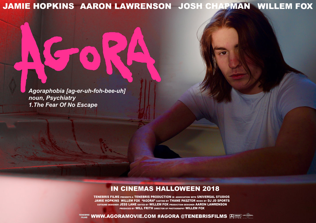
poster design
poster inspirations
|
|
using conventions
- Our poster made use of the conventional titling seen on the majority of film posters, which often includes a focus on actors and/or directors, as well as a release date. This is to keep our media package in line with more established films by following the conventions that would give it credibility alongside such films.
- A common convention with posters is that the typography of the film's title is unique in some way from the other text on the poster so that it stands, either through use of font, colour or formatting. We followed this with our AGORA title being in a handwritten styled font, in pink as contrast to the other titles in white. This title was modelled after the one featured on the KUSO poster.
- Our poster follows the convention of using a iconic image related to the films trailer, that features a key character/object and/or location. This done through the inclusion of our killer/protagonist and the bathroom setting seen on occasions in the trailer.
developing conventions
- While many posters also include select cast members as part of their text, this is often a smaller inclusion within extended poster credits. We developed on this making our cast text much larger to draw attention. This was done to add to the implied concept that the film is independently made by a small group, meaning the cast are perhaps more integral to the whole package than the average film.
- Although we followed the convention of including a tagline in our poster, we used a more unorthodox one. Rather than a quote or descriptive phrase, we used the definition to the films title. This was to allude to themes within the film, while giving very little away, as well as being a much more uncommon tagline choice, adding to the obscure style to the whole media package.
challenging conventions
- Lots of posters will either have a clear foreground and blurred or simplistic background in their poster shot, or have the foreground in a block colour space. We somewhat challenged this convention by using a shot with quite a busy foreground and background. This was to create a more developed space in the poster and to keep it full and engaging despite spaced and simple titling.
magazine design
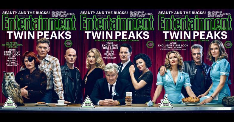
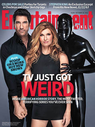
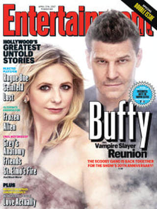
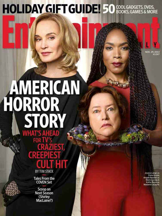
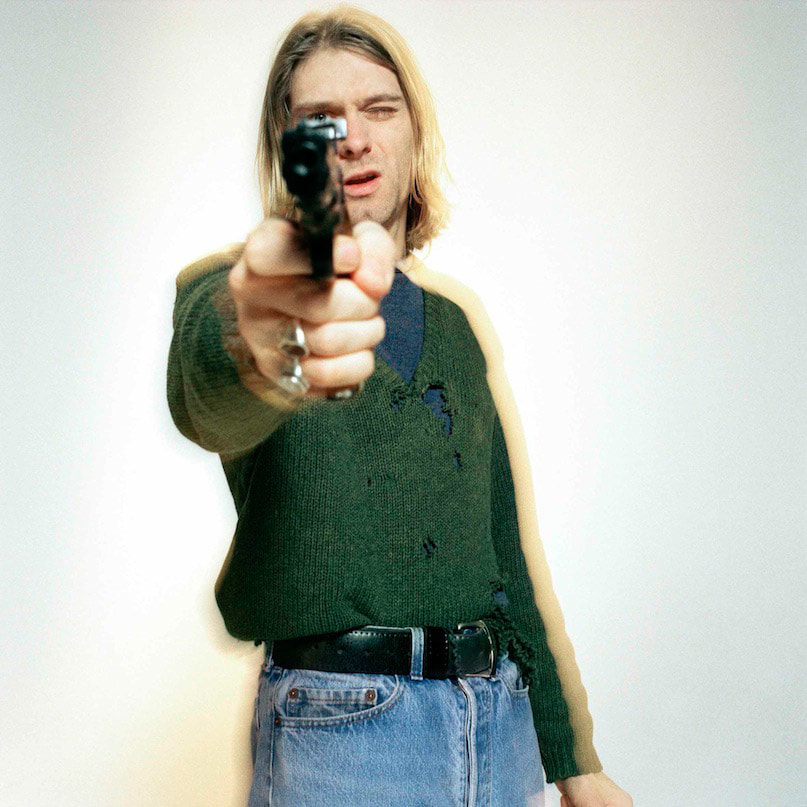
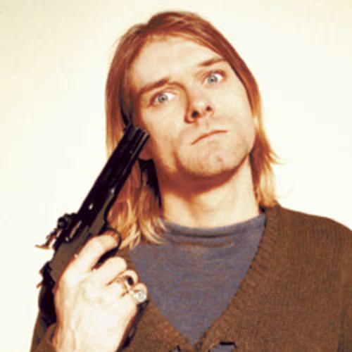
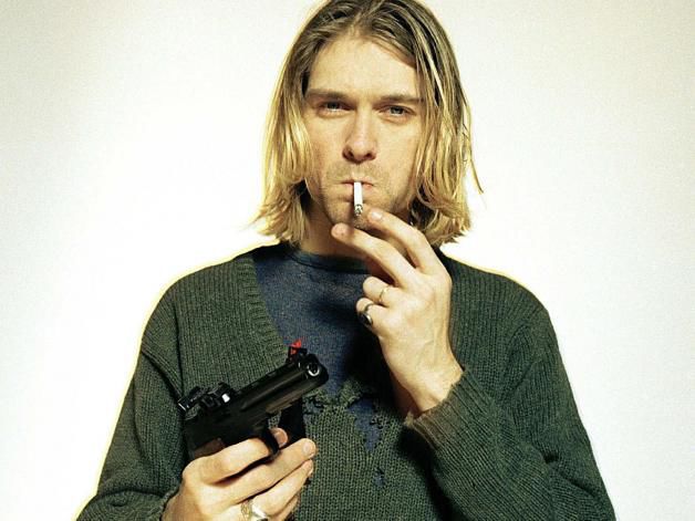
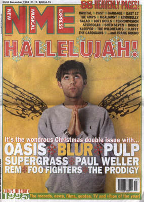
magazine inspiration
|
|
|
|
|
|
following conventions
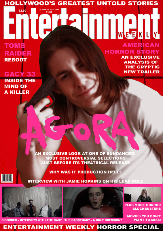
- Our magazine cover adhered to Entertainment Weekly's house style, with our Lead actor in a staged shot that also makes use of a simple background themed by the film. We also followed the common format use by Entertainment Weekly of incorporating their logo into the background, and the colour scheme/formatting of the cover shot influencing the colour scheme or font the magazine's text uses.
- The information provided by our magazine cover also adheres to the style of text common on Entertainment Weekly and other similar Magazines, where Rhetorical questions are used to imply magazine content but keep the reader invested to read on.
developing conventions
- Our magazine cover follows many covers where information about smaller articles in the magazine is promoted. While we have some of this information, it is less prominent than most covers of this type. This was to imply our film and its feature was more important and the main focus.
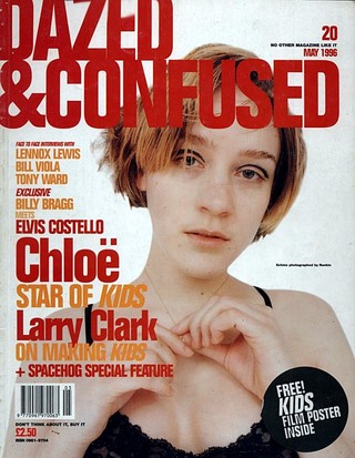
- While our cover uses a staged shot, the shots closer resemble a staged shot for a music of fashion magazine, notably covers seen in the 1990s for such magazines. This was to allude to the key role music and sound takes in the film itself, as well help the magazine stand out alongside others.
challening conventions
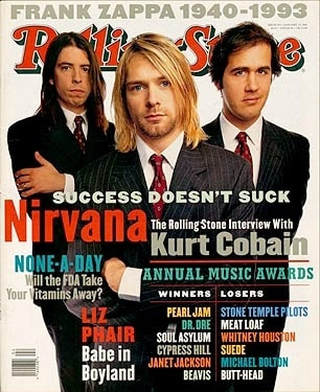
- Unlike most staged shots done for magazines, our shots were a direct homage and reference to a photoshoot of Kurt Cobain. This was done to allude to the similarity between our lead/protagonist and Cobain. It also alludes to a more nostalgic look or style to much of the film itself.
- Most of Entertainment Weekly's covers include their main features title in a font similar or the same as much of the smaller text. We instead used our handwritten style title used in our trailer and poster. This was to help tie each branding aspect together as one image common to all aspects.
