poster ANalysis
When promoting a movie or movie trailer a production company will produce a poster to use as advertisement to attract viewers to watch the movie.
Movie posters will often follow a series of "tropes" common design aspects or information about the film, that is synonymous with film posters. This will often be reworked in some form, to either fit a film's tone or premise
- FROM THE MAKERS OF/BASED ON - This is one way of marketing a film employed on posters, through engaging an audience through a film's associations. If an audience member has a direct interest in an actor or director, then they may be interested to watch another film that feature(s) these things too. This is often given a larger section of the poster space than any extended credits.
- REVIEWS/STAR RATING - This aims to prove the film is worth watching. this is used because as an audience member we have a large variety of good and bad media we could choose to consume. A review tells us we should choose this one because it is quality. Reviews need to come from some form of reputable source (magazines, newspapers, etc.) to be taken seriously and be seen as a selling point for the movie. Reviews are more commonly found on films that take themselves less seriously, as a review will be about the viewer's visceral enjoyment.
- SLOGAN - The purpose of a slogan is to hint at a film's content in a subtle and concise way, that leaves the reader/viewer wanting to know more. Slogans are never longer than a sentence, and commonly reference a key point in the plot (in the case of horror it will usually reference the antagonist).
- TITLE - An obvious addition of all posters, the title gives us in part that way to find out more about the film, and consider whether or not we want to watch it. The title is the more prominent written aspect of the poster.
- IMAGE - This takes up 95% of the poster. like the slogan, it aims to reference key elements of the plot or visuals, without giving away the plot. The image also needs to be instantly eye catching and easily recognisable.
- RELEASE DATE/COMING SOON - Another addition to almost all posters, a date when the film is going to be released. This may be presented as a specific date, the month or year of release , or in some cases an event (for example a horror movie may have its release just as HALLOWEEN). This again is to help inform someone whether or not they want to see a movie, as well as create hype and excitement around the movie. When a movie is listed as COMING SOON, this is done entirely to create buzz and hype around a film.
insidious |
SAW |
|
|
|
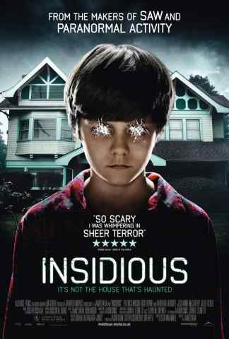
The 'Insidious' movie poster conforms to horror stereotypes as there is a isolated house with the boy stood out front. Despite this the house looks ordinary, therefore drawing the attention of the viewer to the boy who has his eyes scratched out. For those who pay attention to detail, there is a figure seen in the top left window of the house, a possible secret for the niche fans. There are reviews of the film to the side of the boy that are easily readable however not large enough to distract the viewer from the content of the poster. By stating 'From the makers of the 'SAW' and 'PARANORMAL ACTIVITY' films and including positive reviews, viewers know that they can trust the film to be of high quality. The slogan of the poster is 'It's not the house that's haunted', this again gives the impression that the child is being possessed and the house is not the only area of activity.
The silence of the lambs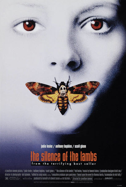
The 'silence of the lambs' poster uses shades of black, white and blue to represent the different colours of death. the colours used on the moth and title contrasts this however, as they are warm colours and represent life. The moth has been placed over the mouth to represent the silence/death within the movie. The moth chosen is called a Death's-head Hawkmoth, as seen, some of the moths have a skull like pattern on the neck. This adds to the symbolism of death on the poster. Unlike most posters the location of the movie is not shown in this poster. This creates more mystery around the content of the film
|
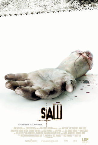
The 'SAW' poster is extremely simple and yet effective at grabbing the audiences attention. It shows a clear white background to entirely contrast horror expectations of a dark, damp setting and also the severed hand, it therefore outlines the blood and draws attention to the title that is in the same colour of the blood (a dark red/brown). The use of the hand implies to the audience what the film is about just by one image.
A Nightmare on Elm Street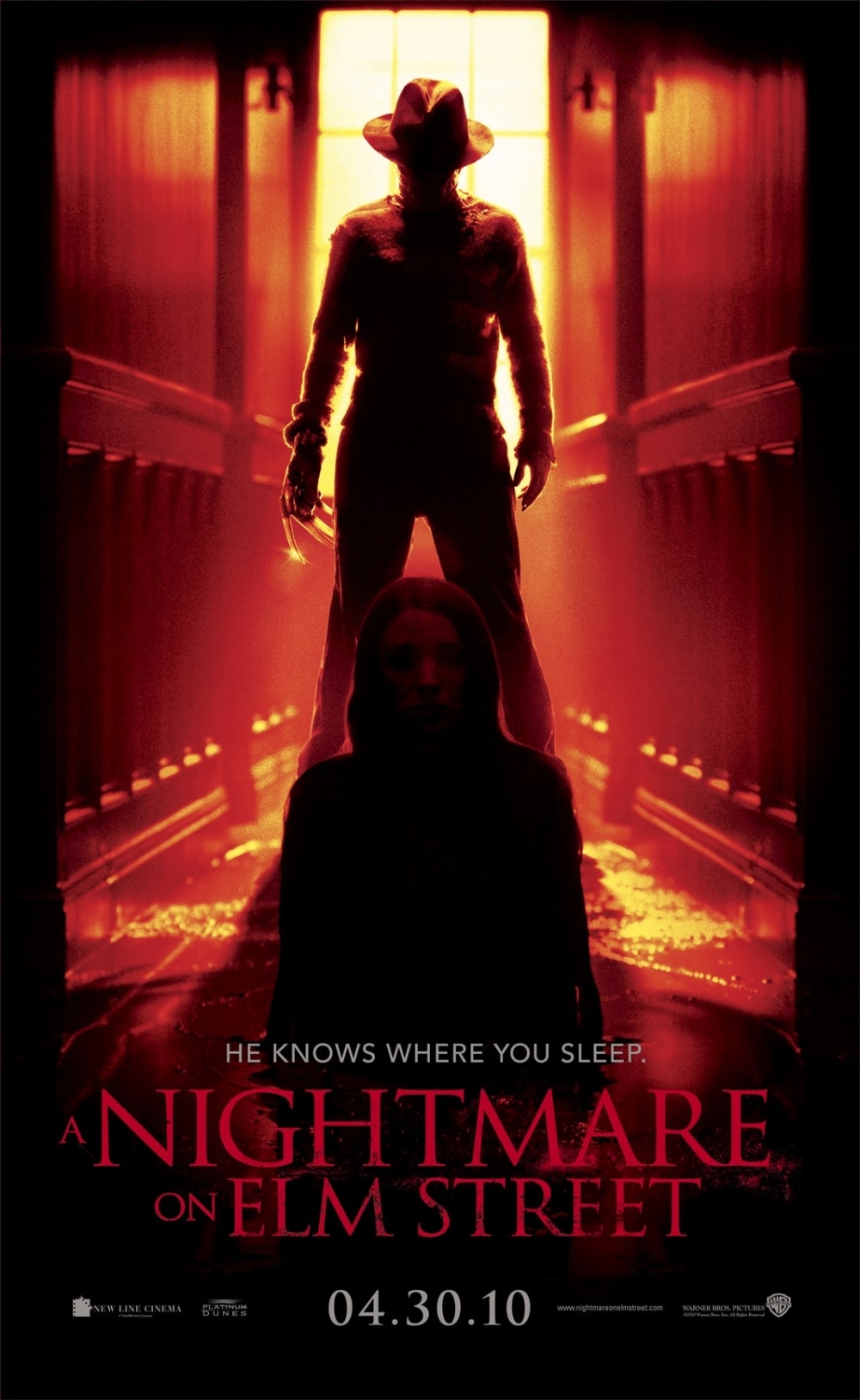
The poster for 'A Nightmare on Elm Street' conforms to horror expectations in multiple ways. Firstly the use of dark colours (red/orange/black) that symbolise death and blood are used throughout, the killer's identity is covered by shadows while still drawing attention the the weapon. However, as seen by the glint/light reflection off of the blades, The blades are attached to the killer which is seen as an extension of the killers body, implying that the kills will be more personal. The victim is more visible yet seems unaware of the killer and is being looked down upon. The title is also red with the word 'Nightmare' being emphasised by the size of the text compared to the rest.
|
