Question 2 - How effective is the combination of your main product and ancillary texts?
When we were creating our media package and discussing our branding, we wanted to make sure there was a consistent visual style throughout all of our media texts. A key way to make your products successful is to make sure there is something very significant about it thats aims to make people remember the film and the products surrounding helping you to stand out above other competition in the horror film industry. If this is done correctly, the iconic image will become well known. This iconic image from your film can be anything visual that stands out from your trailer; it could be a prop, a setting, some form go logo or font or a character.
examples of iconic imagery in horror films
|
|
|
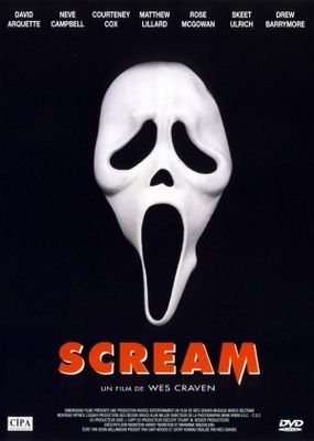
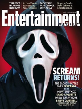
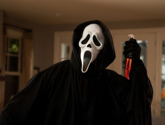
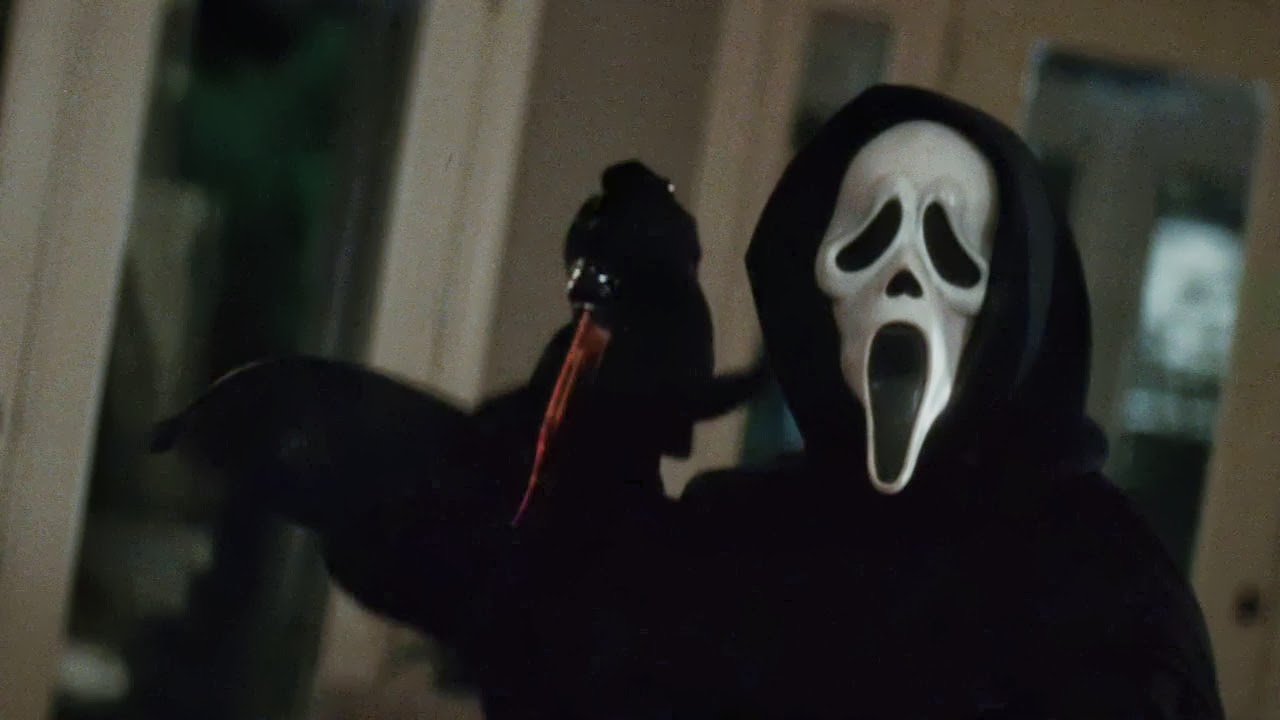
Scream uses the iconic image of their killer's costume/mask throughout their branding, featured heavily in posters etc. after the original films success. This acts as both their logo and an introduction to the film's unsettling villain. This image has become one of the more recognisable images in the horror genre, and has been integral to the franchise itself's success.
|
|
|
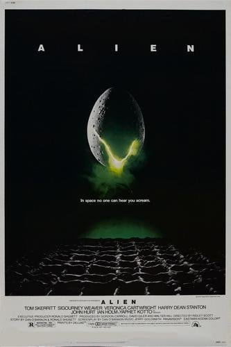
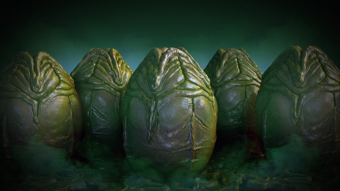
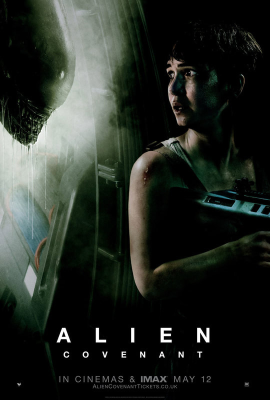
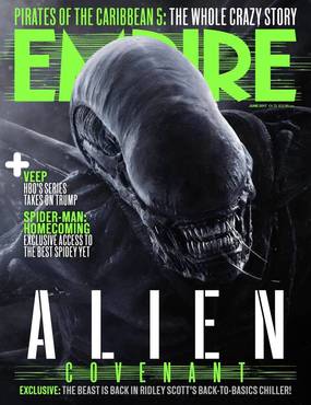
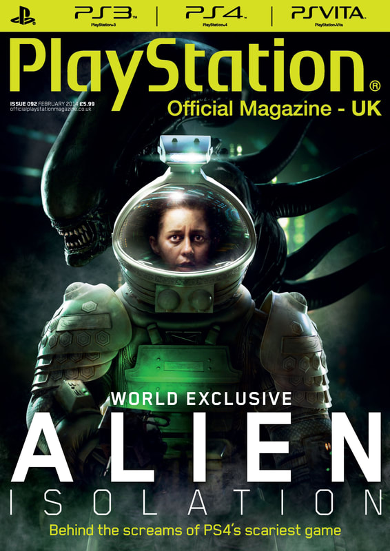
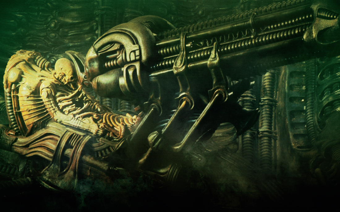
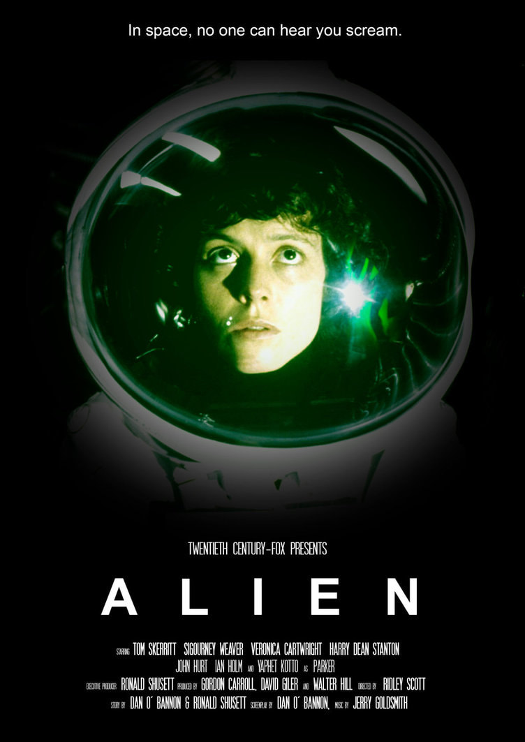
Over the span of the ALIEN franchise, from 1979 to today, an iconic colour scheme and visual style has been followed; a neon green and black colour scheme and often times simple isolated images in marketing that allude to the film's tone. This has helped make the franchise stand out against other horror and Sci Fi, and consistently kept it recognisable as ALIEN, even as the franchise's story choices and direction changed.
|
|
our iconic image(s)
We decided on our iconic imagery to incorporate our lead actor, who we felt has a iconic enough look that he would stand out, alongside our most prominent setting in our trailer, a bloody bathroom, the weapon prop of a gun, and a Pink handwritten logo/title featured in our trailer titles.
our iconic text
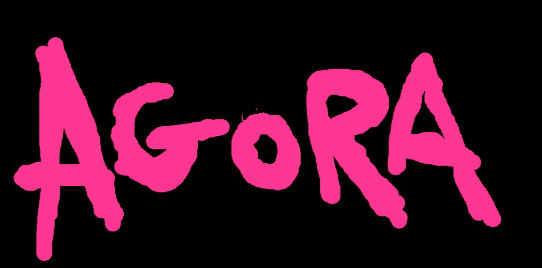
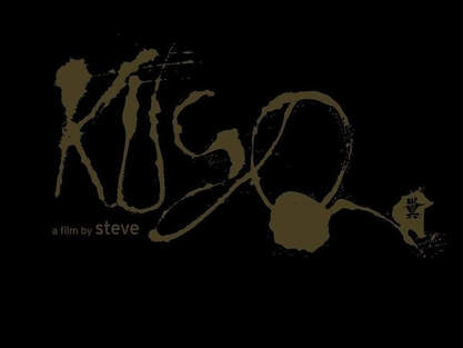
We aimed to create a unique style to our title, that also acts as a logo for the film. This has been used by many majorly successful films such as STAR WARS and Harry Potter, who designed their own fonts which have become instantly recognisable, acting also as a franchise logo, used throughout their branding. Our handwritten pink "AGORA" logo was inspired by the logo text used in KUSO, and is featured on our poster, magazine cover and trailer titles. The scrawly style is intended to acknowledge that unstable nature of our killer/protagonist, and the grimy homemade style of our trailer.
poster image |
final product |
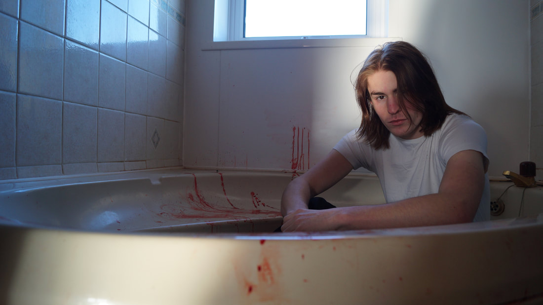
Our photo was taken in one of our trailer's more notable locations, a dingy and bloody bathroom. We positioned Jamie in the bath as an allusion to our trailers closing shots of him using this to drown someone. The lighting of the shot was designed to appear natural, making the room look dull and grimy whilst highlighting Jamie in the shot. Light was pointed at Jamie's face as a result. Jamie is looking directly at the camera to create some unease for the viewer, as well as draw focus to his expression, as this again alludes to the trailer content of his disturbed mental state and deadpan demenour.
magazine image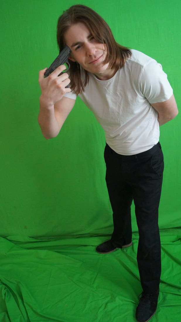
Our magazine image was taken in a empty space to mimic a staged shot that we could superimpose in a separate location that is more abstract. This image was again of Jamie. Although the location is different and more simple, his costume is consistent with our poster. Jamie is shown with the prop of a gun. This gun is featured in the opening to our trailer where someone is executed. Jamie is seen looking directly at the camera in a more imitating manner than in the poster, with the gun pointed to his head. This again alludes to his mental state. When shown together, the poster and magazine are designed to show the two sides to Jamie's character.
|
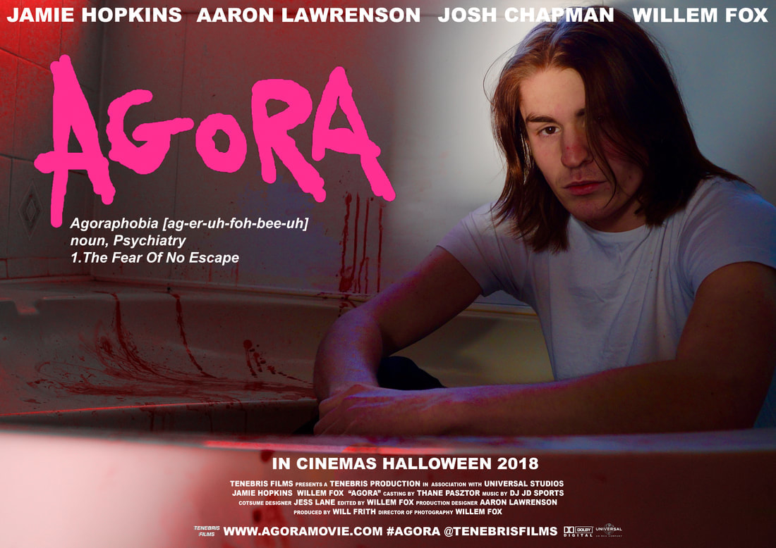
The first edit we made to the photo was to increase the saturation. this was to make the shot more in line with the vibrant and unnatural colour palette seen throughout our trailer. Once imposing the image into photoshop, a lot of the saturated colours were corrected to be red. We wanted red to be the most prominent colour in our print media products, due to its association with blood and the horror genre, as well as because it being featured frequently in our trailer. Much of the text we included in our poster was positioned around Jamie. This was intended to create a clear foreground and background on the entire poster, so that the text wasn't a clearly separate layer. We aimed to have a obvious link between our trailer poster and magazine by consistently using the same pink movie title.
final product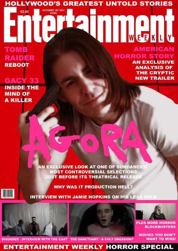
The colour red is again prominent on the final magazine, making up the majority of the background colour. Similarly to our poster, the layout of our magazine intended to incorporate the text into the foreground and background of the image, with Jamie being postioned on top of the magazine logo (a formatting choice seen frequently on Entertainment Weekly) We again used the pink movie title text to create synergy with the other media products we have made, however it is featured in white here so that there is a consistent white text on red colour scheme. The information our magazine gives about the film again ties it to the trailer, which both reference the controversial nature of the film, as well as its inclusion at the Sundance film festival. We used mainly 2 fonts on the magazine, one being used only for information about the film. This was designed so that this information better stood out against the rest, as well as tie to the poster and trailer, which both feature that font.
|
