QUESTION 3: WHAT HAVE YOU LEARNED FROM YOUR AUDIENCE FEEDBACK?
During development we aimed to get feedback on each aspect of the process from our peers and our prospective audience, applying this to what we did next. After we completed the trailer and the rest of our media package, we then looked for feedback and evaluation about the cohesion between our poster, magazine and trailer.
TRAILER FEEDBACK
After presenting our trailer to different audiences we found that we had a lot of the same criticisms and praises. Our biggest compliment was the music and audio used as a whole. Our biggest criticism was that it is hard to understand what the premise of it is, and this is due to the trailer's structure and sequences of shots.
After presenting our trailer to different audiences we found that we had a lot of the same criticisms and praises. Our biggest compliment was the music and audio used as a whole. Our biggest criticism was that it is hard to understand what the premise of it is, and this is due to the trailer's structure and sequences of shots.
TRAILER FEEDBACK FROM THE TARGET AUDIENCE
|
|
|
POSTER FEEDBACK
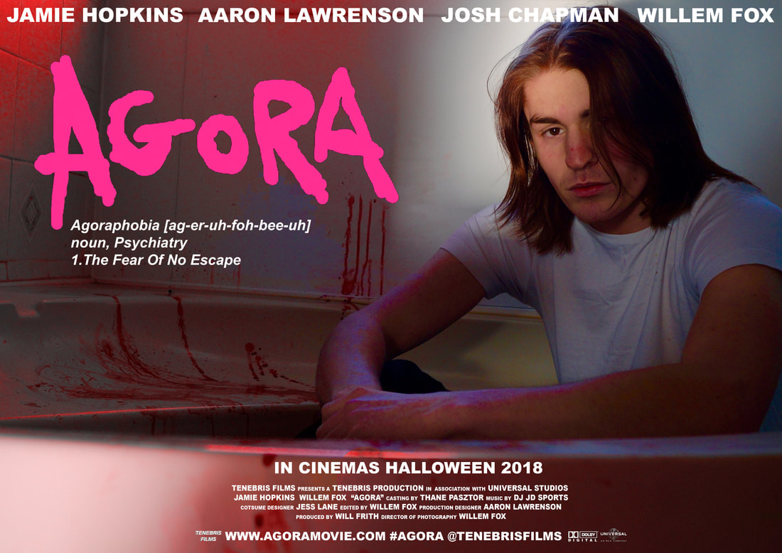
We had a number of compliments about our poster from our audience, for example the quality of the photograph we have chosen from the photoshoot and the location we decided. Although it's subtle we also had compliments about the lighting, in particular the light shining on the killer's face and the red which was intentionally colour corrected in editing. Some improvements we were given was that the text at the bottom could be smaller which we fixed. Otherwise there wasn't any problems with other font sizes we used or the placement of any of the text. One other aspect we needed to change was the sizing of the original poster because the recommended sizing is A3, so we had to crop the original image and move some of the text and change the font size.
BEFORE
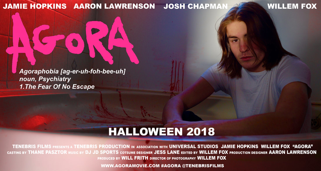
AFTER
POSTER EXPERIMENTATION/ PRACTICE
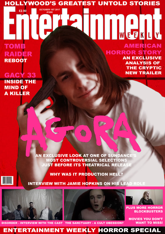
MAGAZINE FEEDBACK
After presenting our work to our audience one piece of feedback we received was that our magazine wasn't conventional to the magazine company 'Entertainment Weekly'. Specifically how the cover is laid out, for example the position of some of the text, to fix this we changed the sizing of the text and where it is placed. To help make it more conventional we also decided to include a film feature at the bottom of the magazine which includes different shots from other trailers. We also decided to change the background of the magazine to something more simple so we used the wall of a bathroom instead of a bloody bath. We kept the red filter but changed the title to just white over pink, giving the white text a very thin pink border.
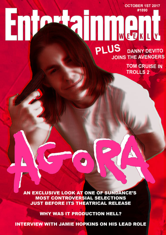
BEFORE
|
AFTER
|
facebook feedback
trailer
poster
SURVEY FEEDBACK ON THE TRAILER AND WHOLE MEDIA PACKAGE
conclusion
After collecting our feedback we found that people had similar positive and negative points about our work, with most people enjoying the unconventional visual style and use of sound, as well as finding that our poster and magazine tied together well with both the trailer and each other. A common complaint was a lack of obvious cohesion in the trailer.
